Photo-illustrations
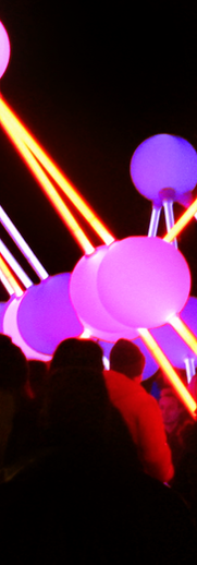
One of the projects I was given while I was doing my Art Foundation course was a photography and graphics brief. For this, I went into Liverpool City Centre looking for things to photograph and I found that there was a lot of art in the city. This ranged from the community murals I found up in Chinatown, to the Liverpool River of Lights exhibition down at the Albert Dock. I wanted the main theme of my work to be focused around how street art is used to display culture.
After I had edited my photographs and had got the colours and contrasts to what I wanted it to be, I added illustrations over them. This was to create an effect that made it look like the artists' work was coming to life. I made sure to try and replicate the original styles in order to make it feel more authentic. All of the inspiration for the style I used for my pieces, came from the original artists and painters


In this series of images you will see the process I went through to get the final illustrated pieces. In this tiger themed one, I tried to keep the sharp and geometric style of the original wall. I also extended the clouds so that they would cover more of the picture.
In this on, I wanted to focus more on the animals seen in the original mural design. So, to bring the art to life in this one, I drew the ox and the dragon stepping out of the mural in a graffiti style.


In this piece, I had the idea of using the different LGBTQ+ Pride flags as the colours for different butterflies, moths and insects. I tried to pick butterflies that would suit the identities best, such as the Trans flag being on a chrysalis to represent a transition, and the nonbinary flag being on a beetle, so that it would be different from the binary of butterflies


